Over the past week I had asked my fellow graphic designers if they’d be interested in submitting their favorite designed logos to be featured on TDC. They were also asked to submit a short description, inspiration or other relevant information that would give meaning and provide understanding of the logo, as I feel it’s important to have an understanding and purpose for every design and is in good practice to get into, if you haven’t already. So without further a due, here’s what TDC readers have to showcase.
Tanner Christensen
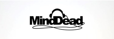
“This was the first logo design I ever did for a paying client (about seven years ago, when I was 16), and it is still getting quite a bit of attention today. The design originally was meant to resemble a head wearing earphones – thus the reason the two “d”s are combined.”
Imativa Design Consultants
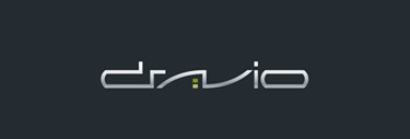
“Logo made for a sofware company – Typo is custom-made for client and is meant to express hi-tech. That was client´s unique requirement.”
Niki Brown
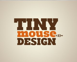
“My favorite logo that I have worked on recently has been the branding for my freelance business: Tiny Mouse Design. I wanted to make a logo that was text only and whimsical. I used a typeface called Romero that is big, blocky and bold to contrast with the tiny little mouse type illustration.”
R27 Creativelab
After initially following a very tight brief, which I created and supplied, I produced one more just to get it out of my system because personally I thought it was the right. The concept, simply a cross section of a tree and the age rings.”
Pixelmagi
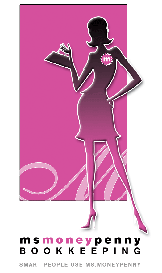
“A progressive book keeping enterprise, Ms MoneyPenny, wanted their corporate ID to reflect the fun, feminine flourish they bring to their level of professionalism.”
psdtolife
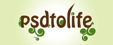
“Designed for a new online company I setup that specialises in PSD to xHTML conversions. I went for an organic look to tie in with the name of the company, this is also shown throughout the website.”
Menachem Krinsky
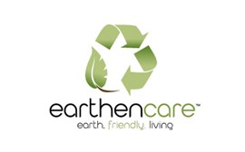
“Made for company who deals with biodegradable products.”
Sleepy Hero
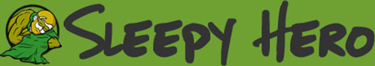
“I designed this logo for my portfolio/freelance brand. I took the name Sleepy Hero because I felt it was a fun/comfortable name and it sounded inviting.”
Andy Jacobson
“[…] Together, the elements create a modern design treatment that identifies with the beliefs and values of The New Shul community.”
Siah Design
“Office Strategies is probably one of my favorites designed logos. I love its simplicity yet having such a strong concept. This logo was designed after the concept popped into my head. Haven’t found a buyer yet”
Acorn Creative
“This logo was created for PaladinID a company that specializes in bar code systems and printing. The owner of PaladinID is what we would consider a “raving fan”. He embraced the process of creating a logo as well as his entire brand.”
Dezinerfolio
“The whole site is design oriented so I planned to have something very creative and fresh. The butterfly symbolizes the freshness of design, and the wings of it are Deziner & Folio”
Lee Graham
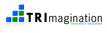
“This is a logo I created for another startup of mine. The design idea is based on TRI/right pyramid (building blocks) and the bright green and blue represents education and innovation.”
Barretto-Co
Brainchild Collective, LLC
“…part of a total re-branding effort which included a new logo, stationary, literature and a website. Other than a dated logo, this company had no other means of promotion or marketing.”
Arron Lock
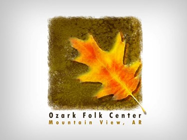
“I designed this long ago for the Ozark Folk Center in my hometown of Mountain View, AR. It was one of the first non-vector logos I had done.”
Lay Creative
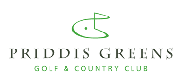
“The thing I like about the logo is it simplicity, but still has a good conceptual foundation that relates to the Gold Club. It’s stylized P & G, a pin flag and a sense of late afternoon on the greens all unite; works well across all required applications.”
David Airey
“It’s for an architecture firm in Tokyo, Japan. My client wanted a custom logotype that fit with the company style.” See David’s process here.
Joseph Allen Kohlhas
“This mark was a concept created for Barduson Architects, an architectural and interior design firm with a strong portfolio of churches and worship spaces. This design embodies the golden or “devine proportion” implies the letter “B” for Barduson and incorporates the vesica pisces a symbol rich with mystical and religious significance.”
Just Creative Design
“My favourite would have to be my own logo because of the amount of effort I put into it and the end result! Wrote about it in full on my blog here.”
The Holmesian
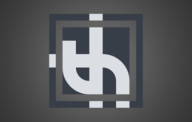
“A logo for my new freelancing business. As for inspiration- I just started doodling logo designs and continued playing with my favorites until slowly this was made!”
Sasha Endoh Photography & Design
“The main idea for the design was to combine elements of art deco, etching (The Flammarion Woodcut) and Hindu culture while maintaining a modern look.” See more of Sasha’s design brief here.
GetSmoked, LLc

“The logo was created for a new local nursery that had recently opened. […] I really didn’t have any inspiring art to take from, I really just sat in photoshop and doodled till I found something I liked.”
Lifesize Studios
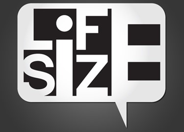
“This is a logo I designed for my personal branding. The idea is to get your message across in a big way.”
fudgegraphics
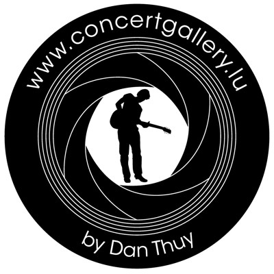
“This logo is for a local photographer who specializes in concert phtography. The silhouette is actually me and first and only one I’ve designed so far.”
krush design + marketing
“Transfers easily across the many applications it was designed for including stationery & collateral, clothing, stickers, outdoor signage, vehicle wraps, invitations and other promotional items. It integrates readily with the support graphics (including striped socks & feet poking out of a ball pool) to appeal to children & adults alike.”
6bdesign
“This is the logo that I created for the pop-culture blog Blendetta.com – because I wanted a unique look, I decided to go with something graffiti-esque. The logo was hand-drawn with pencil and paper, scanned, then digitized in Photoshop.”
Jake Mates Design
LevelOrange
Jeff Fisher LogoMotives
“I like to create logos that are graphically simple, sometimes have a sense of humor, may be a bit controversial, perhaps tweak people a bit and – as in this case – also tell a story. The client, an avant garde theatre company, likes to push the limits with its productions and did so with this self-described erotic stage show, set in New York circa 1987, about men looking for some sort of warmth in the midst of the AIDS epidemic. The logo appears in the books New Logo & Trademark Design (Japan), The New Big Book of Logos, and Logo & Trademark Collection (Japan). The design made a great graphic for a T-shirt – which I wore quote often. Once, without even realizing it, I wore the shirt to the grocery store. A women came up to me and said “What a great T-shirt design.” It was kind of fun watching the expression on her face change as she realized the sexual nature of the design – and quickly walked away.”
DesignFacet
“Logo was designed for the Oklahoma Technical College”
Conan Robbins
“Logo for a home automation and home theater company. Red and Black colors requested by client. Logo was created to attract big ticket clients.”
Calvin Lee Design
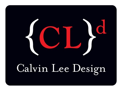
“My inspiration comes from the simplicity of things in life. I wanted a logo that is minimal, simple with clean text design. I love using basic elements like brackets on the keyboard as a design element.”
Mayhem Studios
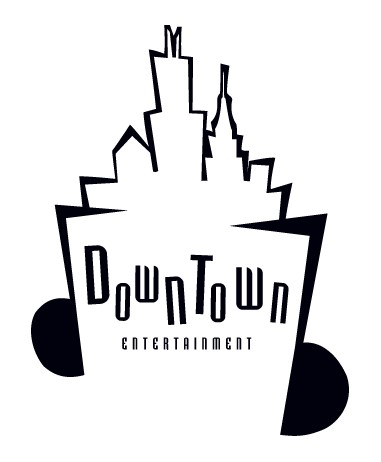
“Inspiration came from listening to all different sorts of music. Infuse the idea of downtown with the beats of music – I love when a logo can give several ideas as one. The results: combining downtown landscape with beats and notes of music listening on headphones.”
Kristi Colvin & Graham Smith

“My company is developing an alternative web-based interface for Twitter called Twitterface. Graham Smith and I collaborated on the logo and can be seen used in different ways here. I think we’ve created a solid logo that gives me lots of branding options, yet retains the basic focal of the logo for memorability which is the yellow bird. […] I have mostly designed the schwag so that the words “twitterface” and “tweet me up” could just be something that applies to the buyer and I haven’t put site url’s etc.”
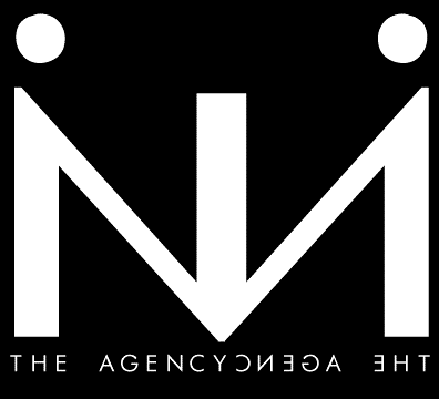
Damien Basile
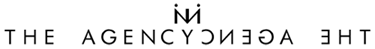
“This logo is for the nightlife event marketing company The Agency NYC. The brandmark is made up of 2 mirrored capital N’s & lowercase I’s, creating the word “in” which visually looks like two people holding a velvet rope granting you access in to the event. The words “The Agency” are mirrored around the letter Y, which has the logo strategically placed above it to create a subtle play on the “NYC” utilizing the “CY” in Agency and the “N” in the logo.”
Andy Sowards
“The logo came about when I needed to build myself a website. I wanted something original that I haven’t seen anywhere really on the internet so far, so I chose to go with a ‘post-apocalyptic/futuristic’ world theme. That way I could build the rest of the site around it to be themed that way, to give an overall effect of being a part of ‘my world’ that I have created.”
Tiki Toon
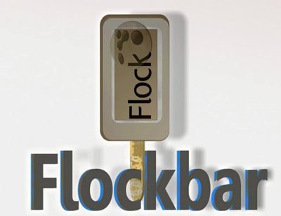
“Sometime ago it wore friends nerves how passionate I was about the Flock browser. It’s true! O passionate user’s are ‘flockstars’ and the official website offers it’s logo png and gif images for making Flockart. I was inspired.”
Sparky Firepants Images
“Created for a client who does scenic design for theater and amusement parks. His existing logo was pretty good and he liked the colors. However, he contacted me to create a new one with more energy and something that looked a little like him.”
William Biwer: The Design Lab
“The logo was designed for self promotion for my portfolio and blog. The goal was to create something simple that complimented the idea of a ‘design lab’.”
Sean Farrell
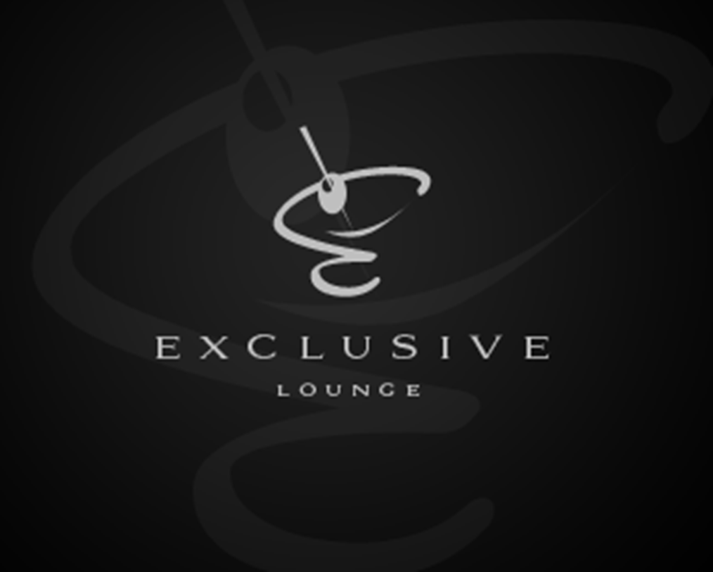
“…designed was for a lounge/VIP restaurant specializing in a variety of drinks. It was featured on a number of sites, and also placed top 15 in incsprings ultimate branding challenge.”